How to Build a Great Landing Page?
There is a special recipe (put together and perfected by inbound marketers all over the world) that you should follow to increase your odds of conversion on the landing page.
#1
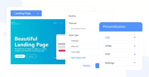
Create unlimited websites and landing pages using the visual drag-and-drop builder with no code
#2
Add unlimited domains, web pages get free SSL certificates, and built-in SEO
#3
Free SSL Certificate
#4
Improve page rankings with built-in SEO tool, NinjaSEO
#5
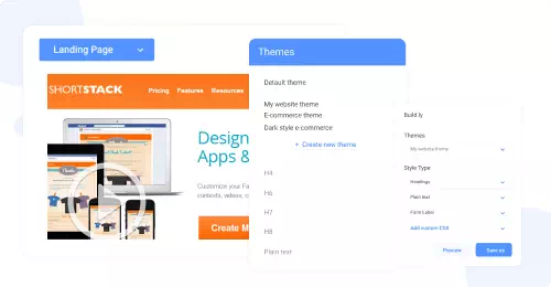
Choose from a number of pre-built templates to build fast, responsive websites
#6
Easy & Fast to Build
#7
Increase your web page loading speed with edge servers located in 6 locations
#8
100% Personalization
#9
Unbelievable pricing - the lowest you will ever find
#10
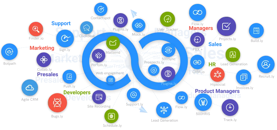
Everything your business needs - 50 apps, 24/5 support and 99.95% uptime
Once you have the background research in place, it's time to put the landing page together. However, there is a special recipe (put together and perfected by inbound marketers all over the world) that you should follow to increase your odds of conversion on the landing page.
Landing Page Best Practices

Devise a Compelling Headline
You need to develop a compelling headline that will instantly capture the visitor's attention and make them want to learn more. It is the first thing they'll see when they get to your landing page, so it serves as one of the most important things about your business. Don't disappoint them with something mediocre!
Efficiently Convey the Value of Your Offer
You need to make sure you convey your message and offer clearly on your landing page. The blink test says people need to see it in less than 5 seconds or they won't read it which is just 5 words. This means that you have about 3-5 seconds to impress people on your landing page. If you haven’t done so, they might decide that it’s not worth sticking around here due to their short attention spans.
Include Bullet Points
We humans like to mix things up and we often have short attention spans when it comes to landing pages. Avoid writing long paragraphs and use bullet points instead. Summarize the offer in 1-2 sentences, and then provide a bullet point list of what people will receive by downloading the material. Presenting this information as bullet points will keep the reader engaged while also giving them a preview of what's to come, which can entice them to convert.
Build the Form
When placing your forms on conversion pages, ensure you are not overloading them with unnecessary fields. The number of form fields on conversion pages should correlate with the stage in which you are at in the buying cycle. Typically, for an awareness campaign, you want to keep the form brief and ask for basic information such as name & email address.
The further down the funnel your content is, the more fields you should considering adding as leads are getting closer to buying. Once they’re at the decision stage, you’ll want to get more Information from them will help the salesperson understand thecontact better so they are better able to close the sale.
Remove Site Navigation
When you are building your landing page, you want to remove any opportunities for the visitor to leave on their own volition. Doing this will force them to focus on what you have for them at that moment, rather than becoming distracted by other possibilities.
Insert Images
A powerful and engaging landing page needs to include an image, and this is particularly true when it comes to focusing on a specific niche. Visitors will be more likely to stay on your page if you use an image that draws them in, making them want to learn more.
Add Social Sharing Icons
Although you should remove all navigation from the landing page, it is important to include social sharing icons so that people can share the landing page with others across their social platforms. When you do this, however, be sure that when you click on the icon it opens in a new tab or window. You don’t want to redirect people away from the page, but you want to give them a clear option to promote it.
Provide Testimonials When Relevant
These days, people are always looking at reviews of products and services before making a purchase, and this can apply to landing pages as well. But don’t include a testimonial that only vaguely ties in to your offer.Make sure it directly relates to what you're promoting. If it doesn't, it's best to leave it off. The same advice goes for placing awards and accolades on your page.
Make Sure Your Instructions on Next Steps Are Clear
A form on a landing page typically implies that you should fill it out, but be sure to include copy that suggests this on your landing page as well (typically near the end of your copy). This could be something as simple as, “To access the e-book, please fill out the form to the right.” It’s simple, but it gives your visitor clear instructions on next steps, which will make them more likely to convert.
Helpful Hints

Proofread
One of the most important things when someone visits your landing page is to look credible. To do this, you need to safeguard against common writing mistakes - like for example mixing up ""you're"" and ""your"". It is important to triple-check everything on your landing page. If you know there are mistakes that you can't see, ask someone with good editing skills to do the editing for you.
Aim to Keep Your Copy Above the Fold
Although this isn’t a set-in-stone rule, the longer the copy on the landing page is, the less likely you’ll be able to keep somebody’s attention. Aim to be concise with your message and keep everything above the fold.
Test Your Landing Page
Again, you’d think this is a given, right? It’s not. Once you’ve developed a CTA that links to your landing page and a thank you page that the landing page redirects to, test the full process. Click on the CTA, fill out the form, and download the offer on the thank you page. Make sure all steps are in place from a user’s perspective, and confirm your contact info has been stored in the database to ensure everything is functional from a behind-the-scenes perspective.
Promotional Tips
Your job isn’t over once the landing page is complete. In fact, it has just begun. You need to get people to view your landing page—otherwise, what was the point of creating it? Below are top recommendations to promote your landing page.
CTAs
As previously mentioned, CTAs are a great way to promote landing page content. Remember, the CTA needs to resonate with the content it lives on and with the landing page. The more cohesive these assets are, the more likely people will be to convert. Put the CTAs on site pages with a lot of visits that are relevant to the offer and in blog posts that support the offer.
Email is a great way to promote your landing page. Send a promo email to a targeted list as opposed to an entire email database. The more targeted the list is in relation to your landing page, the higher the odds are that people will convert. Don’t feel like you need to reinvent the wheel with this; a lot of the landing page content can be repurposed into emails.
Social Media
As you’re probably aware, social is a great tool for spreading the word about your content. However, word to the wise: Don’t promote on every platform because that’s what you think you’re supposed to do. Select the few platforms where you know your personas are and promote heavily on those platforms. Don’t promote on a Facebook page just because everybody else is doing it—think about whether your personas are avid Facebook users. If not, you should probably look elsewhere.


