What Are the 5 Principles of Web Design?
A nice design is essential in making a website appealing. It has the power to make or destroy your website's usability.
#1
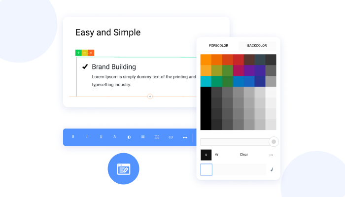
Create unlimited websites and landing pages using the visual drag-and-drop builder with no code
#2
Add unlimited domains, web pages get free SSL certificates, and built-in SEO
#3
Free SSL Certificate
#4
Improve page rankings with built-in SEO tool, NinjaSEO
#5
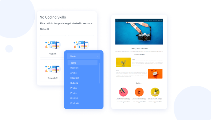
Choose from a number of pre-built templates to build fast, responsive websites
#6
Easy & Fast to Build
#7
Increase your web page loading speed with edge servers located in 6 locations
#8
100% Personalization
#9
Unbelievable pricing - the lowest you will ever find
#10
Everything your business needs - 50 apps, 24/5 support and 99.95% uptime
In this age of attracting customers online, masterful business owners recognize the significance of having a catchy, unique, and tempting online outlet. The most important thing in making a website attractive is a good design. It can either make or break the usefulness of your website. Exquisitely designed websites serve this purpose tremendously. They result in higher customer engagement and turn them into loyal clients.
No business can afford to watch it go down the drain because their website turned customers off. Humans being attracted to beauty is a law of nature. The appreciation of beautiful things throughout the world is undeniable. If the first stage of your business methodology is a beautiful website, then the chances of the customer exploring it are very high. Monotonous and bland websites do not garner a second look by most customers. Many aspects can improve the design of any website, and NinjaSites brings you all of these in one package.
Simplicity
Have you ever wondered why some websites that look so simple are so appealing? This is because websites are most effective when the customers can easily navigate through them. User-friendliness and simple designs go a long way in tempting customers. Incorporating simplicity into a web design is about removing any difficulties it creates for the users. This can occur for many reasons, such as difficulty in reading, navigation, and understanding. If the secondary colors of your website diminish the primary text, then you need to tone them down a little.

Similarly, navigational choices can sometimes be tricky. Create a simple design with simple navigation and one-click action. The customers don't like to waste their time finding things. They want everything handed to them. Make sure to organize it so that everything is easily accessible for them. Have you noticed how everyone is attracted to Apple products? It is because of their simplicity.
Writing for Lazy People
If someone is shopping online, the chances are that they either prefer online shopping or are just lazy. Keeping this in mind, your website should be appealing to lazy people. The average user does not want to put in the effort to research something on your website. Instead, they want to access things with one action. That is how an effective website works. It provides people with no interruptions and easy navigation to all products.
The best way to interest a lazy user is to make them curious about your product. You can highlight the important things about your website. Make use of headlines, sub-headings, and bullet points. The users appreciate short, simple, and to-the-point sentences. Customers feel better when they are told what to do instead of exploring your website like a stranded person alone on an island. Your content must be engaging but simple. Being too clever makes people think, and they mostly prefer to go back instead of thinking.
Choosing Colors Wisely
A soothing visual dynamic can enhance the user's experience exponentially. Well-thought-out color schemes can bring in a lot of attention from the customers. Colors that complement each other create an inviting and harmonious atmosphere that allures the clients to stay. Once you have decided on all the content for your website, choose contrasting colors for its background. This will highlight the text while keeping it visually attractive. Distinguish your headings by providing spacing between them. You can choose colors such as white or black to improve the visibility of the content on your page.

Let Your Content Be Found Easily
One of the most common web design principles is "the three-click rule". As the name implies, users should find all the information they are looking for within three clicks. This goes back to navigation and ease of access. Divide your webpage into separate parts that let the customers decide what they want to proceed with.
Make it easy for your customers to contact you from your homepage. Adding location can also help you tempt customers because of the familiarity factor. Try adding different boxes, sidebars, and links to make your content unique and attractive. Divide the content based on significance, so the customers don't waste any time.
Clarity of Purpose
One thing that most people fail to recognize is the true aim of their website. A website's secondary aims can be to make sales or generate leads, but the primary objective of any business site is to promote the company name and make it a brand. This ultimately brings in more revenue. Your clients use web browsers to reach your website looking for your product or service. Make sure that your website stands out in a pleasant enough manner to make them stay. The website's usability, visual experience, and user-friendliness are the major factors in determining how successful the business will be. The good news is that NinjaSites is designed to cater to these visual aspects.


